Flexible Content Issues
Page Options – Slider (above)
Content is much wider than all other content blocks, should be the same width as the normal page margins like the rest of the flexible content blocks.
There is also no bottom padding.
Columns Blocks
Padding isn’t equal on the top and bottom of the Columns Flexible Content Block. As shown below.
When adding a .svg icon – the icon fills the width of the column, no matter what size you set it to in the block.



1/3 Layout Changes
Would be good to have the ability to swap which size the 1 and the 3 are. (1/3 and 3/1)
As stated above, the padding on top and bottom is different.
Option to align content to be vertically centred or top aligned on all Column Block Layouts, so that there isn’t a massive gap below text if the image is taller than the text.
Lorem ipsum dolor sit amet, consectetur adipiscing elit. Quisque eget massa quis risus tempus feugiat at sit amet tortor. Sed sagittis metus eget quam euismod accumsan. Quisque sapien odio, tincidunt at commodo quis, tincidunt et purus. Ut vitae quam lacus. Lorem ipsum dolor sit amet, consectetur adipiscing elit. Vestibulum et nulla leo. Curabitur non nisl mauris. Morbi vitae ipsum eleifend, varius mauris vitae, imperdiet nisl.

Gallery Slider
Content is going all the way to the edge of the page, instead of the page margins like the rest of the flexible content blocks.
There is also no bottom padding.
Signpost Block
Font size of title is currently 52px, which is bigger than the H2 which is 42px. Can we change this to match the H2 sizing?
More padding on the right hand side than there is on the left.
Can we change the padding in between to be wider, more like 2rem, like the gap in the Columns Block on Layout 4.
Related Posts Block
Third column seems to have padding at the bottom, making it taller than the other two.
Related Articles

Band Tours
For over 55 years we've created your tailor-made youth, school & adult concert tours. So, what you waiting for? Let's start planning together.
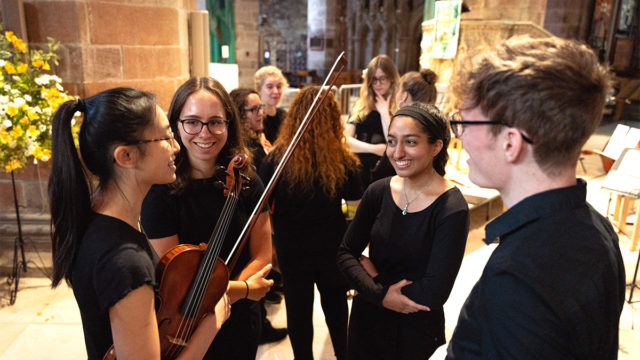
Concert Tours
For over 55 years we've created your tailor-made youth, school & adult concert tours. So, what you waiting for? Let's start planning together.

Orchestra Tours
For over 55 years we've tailor-made your youth, school & adult orchestra tours. So, what you waiting for? Let's start planning together.
WYSIWYG
Can we have the option to change the background of WYSIWYG blocks to be dark blue or light blue, like the columns blocks?
Other Issues
Links in text that are inside column blocks don’t seem to underline like links used in WYSIWYG. But also some links seem to not keep the underline all the way through, see following page intro: https://www.rayburntours.com/educational-trips/trips/school-history-trips-to-krakow
It seems like when linked text falls onto a new line, it breaks the underline styling.
Padding across all blocks is inconsistent, leaving weird spacing between blocks. Would be great if every block had the same padding.
